AndrewEats - Responsive web design
Type: Group
Team size: 3
Worked delivered: All aspects in the process
Time: 6 weeks
Abstract:
This is my project in CMU's interaction design studio, which in a team of 3 we are designing the solution following the user center research and providing with wireframes and prototypes. AndrewEats is a platform for members of our Carnegie Mellon community that helps people compile food options and organize them based on their needs. We provide information such as waiting time, proximity, dietary restrictions, and delivery service. Specifically, we focused our design on two distinct users.
Interviews and observations summary:
Based on our interviews and observations, it seems that most students are not satisfied with the food offered on campus. This is because they find the food too expensive, do not find it satisfactory, or do not think there are enough meal options for them. People usually eat on campus only if they are on a meal plan, have access to freshman meal blocks, or for convenience. Many people also often prepare their own food at home to eat on campus. Of those people, they often go grocery shopping once a week to have fresh food to cook and purchase groceries from markets that are near bus lines. Moreover, a lot of people seem to be unaware of the food trucks that are on tech street as a food option near campus.
Affinity Diagraming:
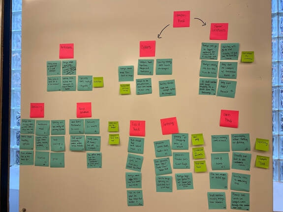
Problems worth solving:
- Not a lot of people know nearby off-campus food options
- Food provided on campus is not promoted very well
- People want to get their food efficiently
- People are mainly concerned with taste, health, and convenience when it comes to food
- People normally have a 45-50 minutes lunch break
- Many people are unaware of the details for the Tech Street food trucks
- A large amount of data of different restaurants spreads through different platforms like yelp, google, Uber eats is overwhelming for the user to search
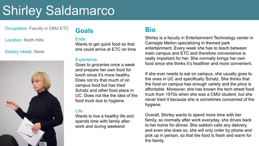
Persona and scenario:
|
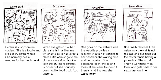
Serena is a sophomore college student and she is also a foodie which she likes to try different food and restaurants and she will be pleased if she knows that her favorite restaurant “Little Asia” provides new special dishes. She normally has 45 minutes during her lunch break, but she is also an indecisive person when it comes to picking the food, and therefore sometimes it’s hard for her to explore new food in a short period of time. One day, Serena gets out of class and needs to find a place to eat. She opens up the website that her friend just recommends her in the class. She finds out that the website provides a list of options for on-campus and off-campus food based on the waiting time of the restaurant and her current location. She is also able to click in the options to see the updated menu and discounts. She found that Little Asia is offering a student discount for lunch this month and it’s only a 7 minutes walk and the wait is not too bad according to the website. She then enjoys an efficient and wonderful meal with the student discount in Little Asia. She could now still explore the food options in a short period of time without spending much time deciding.
|
Storyboard:
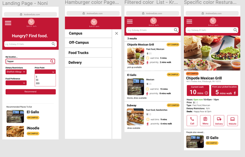
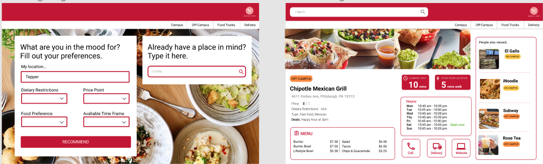
Recap from research: Based on our prior research, it seemed that most people were concerned with convenience, health, and taste when it came to food. Moreover, many people were unaware of all of the quick food options they could eat from near or on campus. Given this, we want AndrewEats to provide a platform that helps users compile food options and gather and organize the data based on their needs, with information such as waiting time, proximity, and delivery service. This platform will be distinct from other food platforms because it is unique to food options at Carnegie Mellon. Specifically, we focused our design on two kinds of distinct users: The explorer and time cruncher. The explorers are the people in CMU community who would like to explore more food options on campus and around the campus and the time crunchers are the time crunchers are the people who already have a restaurant in mind, and just want to get your food quickly. We design our responsive web features based on the above two groups of user’s needs.
Initial wireframes:
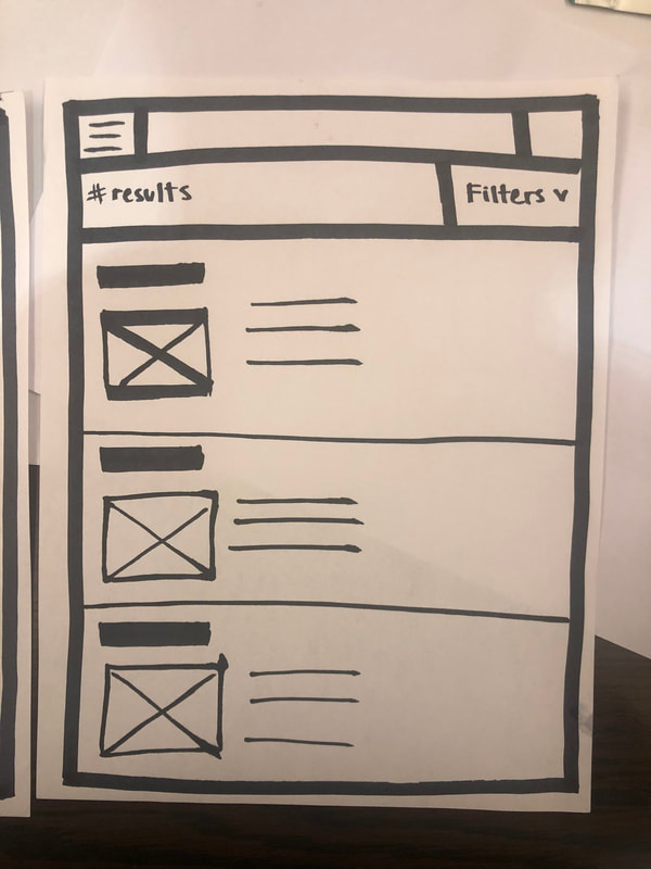
|
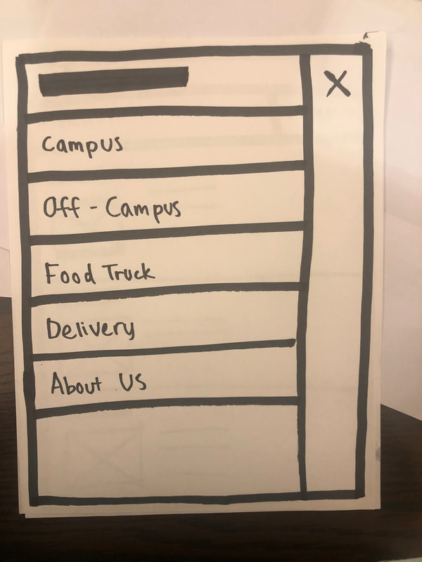
|
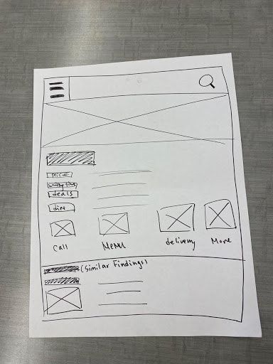
|
Task-based wireframes in a click-thru format (Mobile) with Figma:
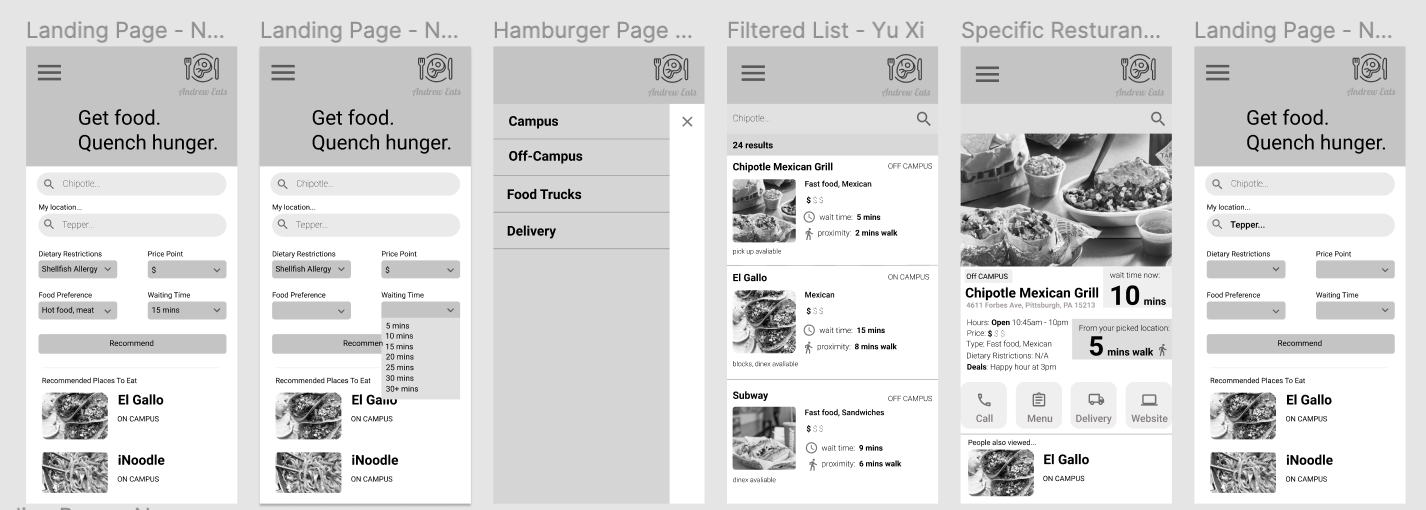
Task-based wireframes in a click-thru format (Desktop) with Figma:
User Testing Findings:
The most common sentiments among our testers were simply that information wasn’t clear enough, and that the information hierarchy was displayed incorrectly because there were a lot of features that they missed. Overall, understanding the recommendation system was really simple for people. They instinctively knew to choose from a drop-down menu, and no one had any questions about how it worked. However, some people went straight to the drop-down menu before typing in their location, and did not notice that it asked for their location until the very end. A lot of testers had issues distinguishing the Quick Search feature from the extended search features, and did not understand its purpose until after it was explained. Also, when they wanted to click into their restaurant of interest, many of the users clicked on the box, and then clicked around for a while before they saw that they could only navigate to the next page by clicking the text of the restaurant. A lot of people remarked that this was inconvenient.
The most common sentiments among our testers were simply that information wasn’t clear enough, and that the information hierarchy was displayed incorrectly because there were a lot of features that they missed. Overall, understanding the recommendation system was really simple for people. They instinctively knew to choose from a drop-down menu, and no one had any questions about how it worked. However, some people went straight to the drop-down menu before typing in their location, and did not notice that it asked for their location until the very end. A lot of testers had issues distinguishing the Quick Search feature from the extended search features, and did not understand its purpose until after it was explained. Also, when they wanted to click into their restaurant of interest, many of the users clicked on the box, and then clicked around for a while before they saw that they could only navigate to the next page by clicking the text of the restaurant. A lot of people remarked that this was inconvenient.
Next step:
For both of our mobile and desktop prototypes, we were also informed by users that our food preference categories were not very helpful. Originally, we had combinations of hot food, cold food, meat, and no meat as options for food preferences. In order to make it more helpful, we plan to change the food preference category to show different cuisines, such as Chinese, Indian, American, Italian, Mexican, and Vietnamese food.
For both of our mobile and desktop prototypes, we were also informed by users that our food preference categories were not very helpful. Originally, we had combinations of hot food, cold food, meat, and no meat as options for food preferences. In order to make it more helpful, we plan to change the food preference category to show different cuisines, such as Chinese, Indian, American, Italian, Mexican, and Vietnamese food.
|
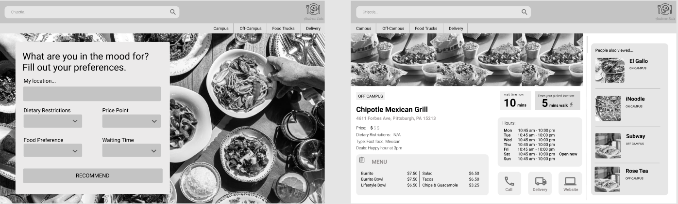
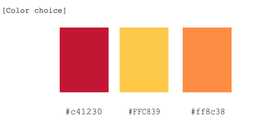
We decided to choose the Carnegie Mellon University red for this website since it is dedicated for the CMU community. Another 2 colors are warm color that is close to the analogous color of the red, however, it could provide the contrast and it is used in the tag of different categories.
|
Final click-through (Mobile):
Final click-through (Desktop):
Final pitch solution with final prototype:
